Stainless Records
- Brand Identity
- Logo Design
Stainless Records is a concept identity for an independent record label built around clarity and permanence — a sound that doesn't tarnish, across a catalog with no single genre home.
The mark pairs a sculpted "S" — half vinyl groove, half polished chrome — with a cool cyan-to-blue gradient and a clean grotesque typeface, carried through stationery, packaging, and studio collateral built to hold up release after release.
- Type:Self-Initiated
- Role:Brand & Identity Designer
- Scope:Logo, Typography, Stationery
- Focus:Brand Identity, Print Collateral
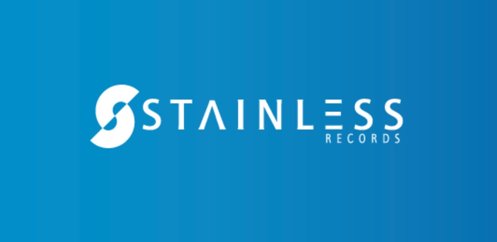
Brand Mark
The Stainless Records wordmark and symbol, on brand blue.

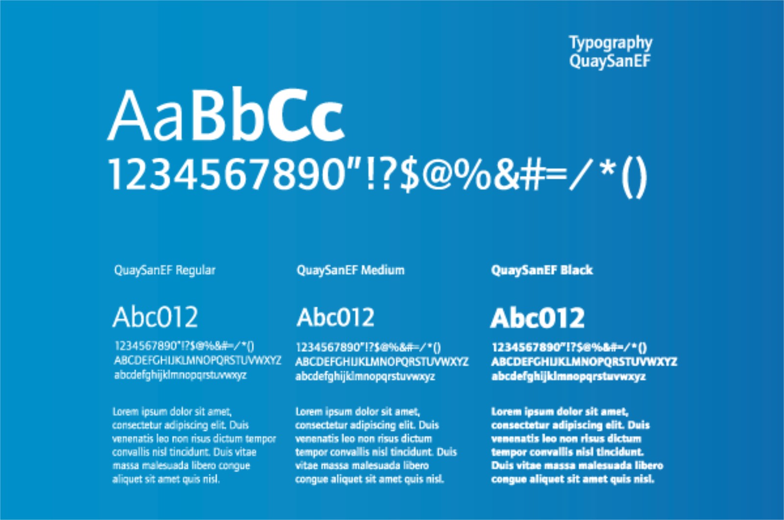
Typography
Type specimen for the identity's grotesque type family, weighted for longevity across formats.
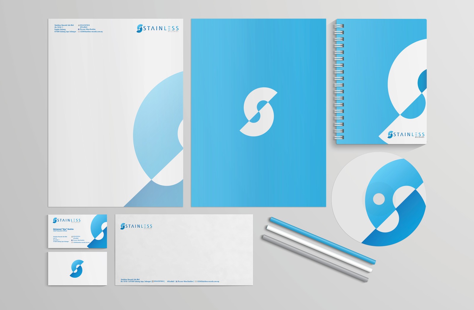
Stationery
Letterhead, business cards, notebook, and packaging collateral.