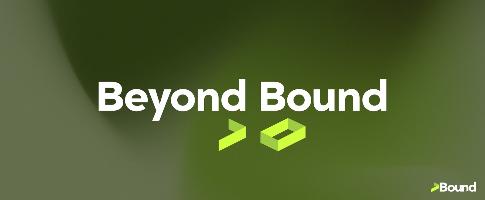
Beyond Bound
- Brand Identity
- Logo Design
- Motion
Bound is a tech company built on coding and design-crafted product — design is the differentiator inside the work, not a service sold on its own.
I developed the naming logic, mark, color system, and launch applications: a wordmark and symbol that read the same idea in three registers, carried across posters, environments, and motion.
- Type:Self-Initiated
- Role:Brand & Identity Designer
- Scope:Naming, Mark, System, Applications
- Focus:Brand Strategy, Logo, Motion
The Mark
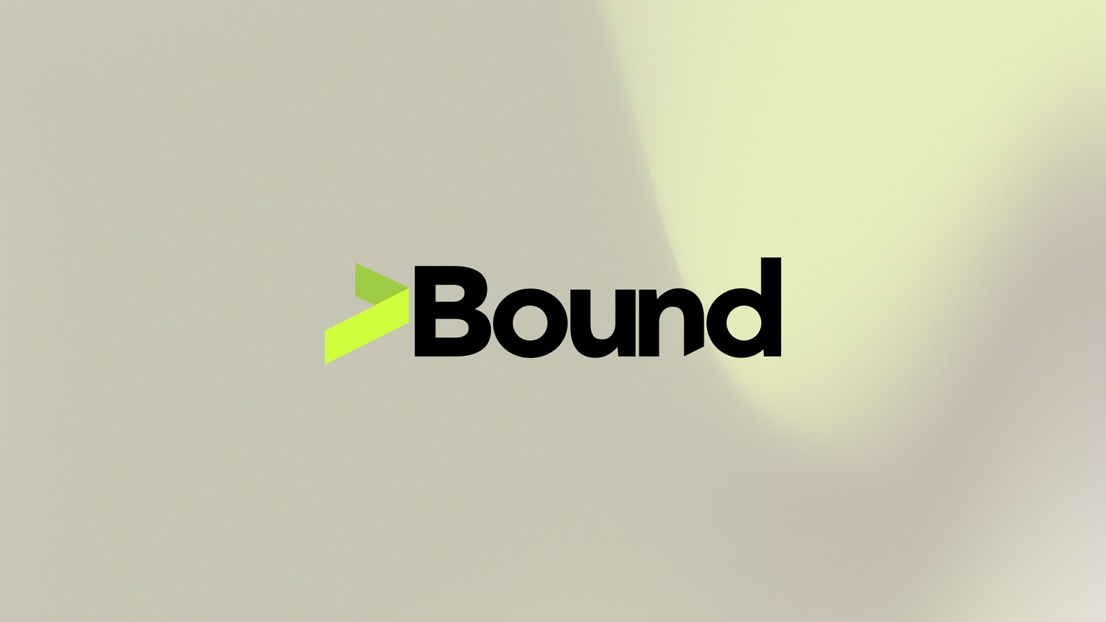
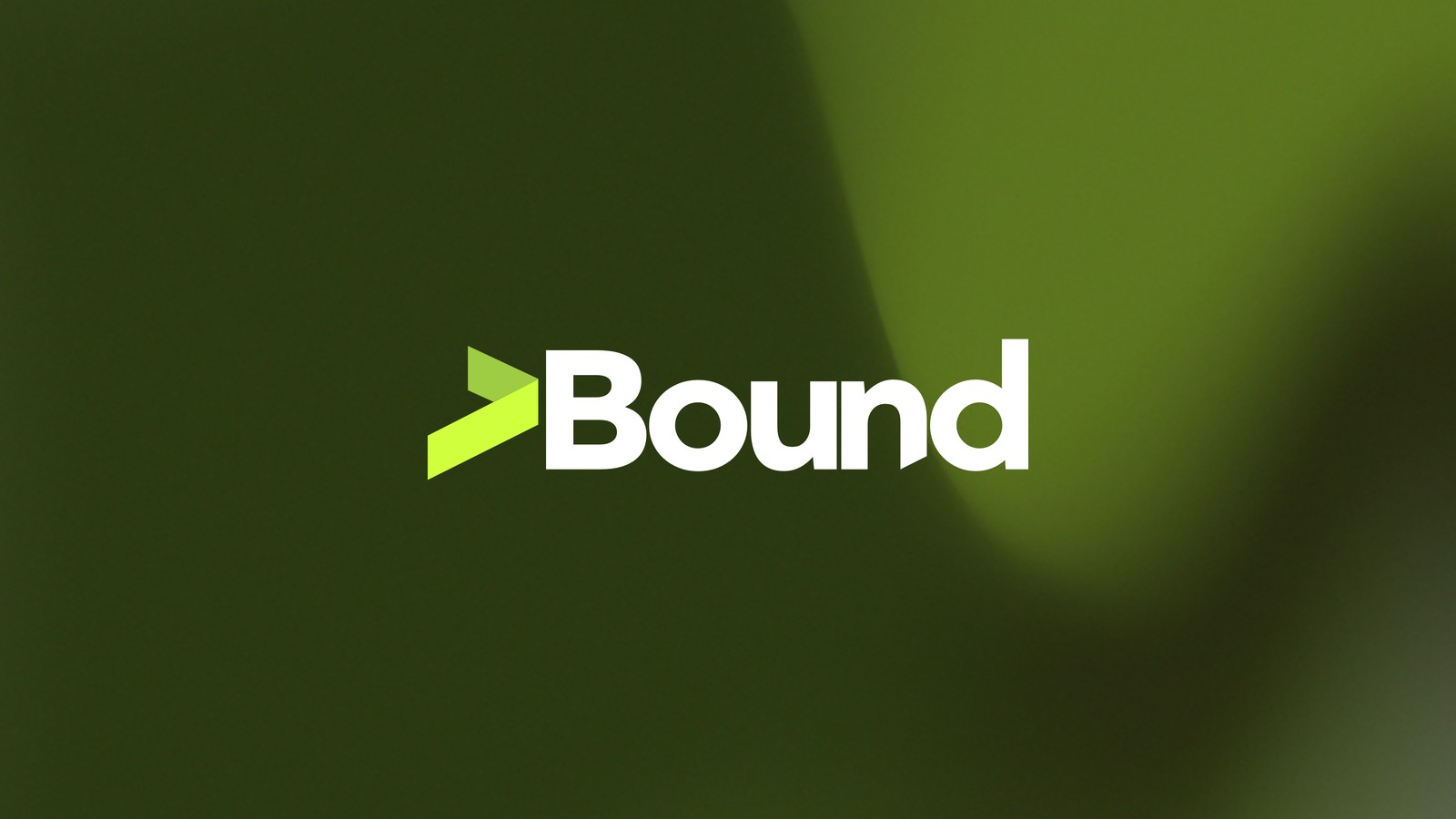
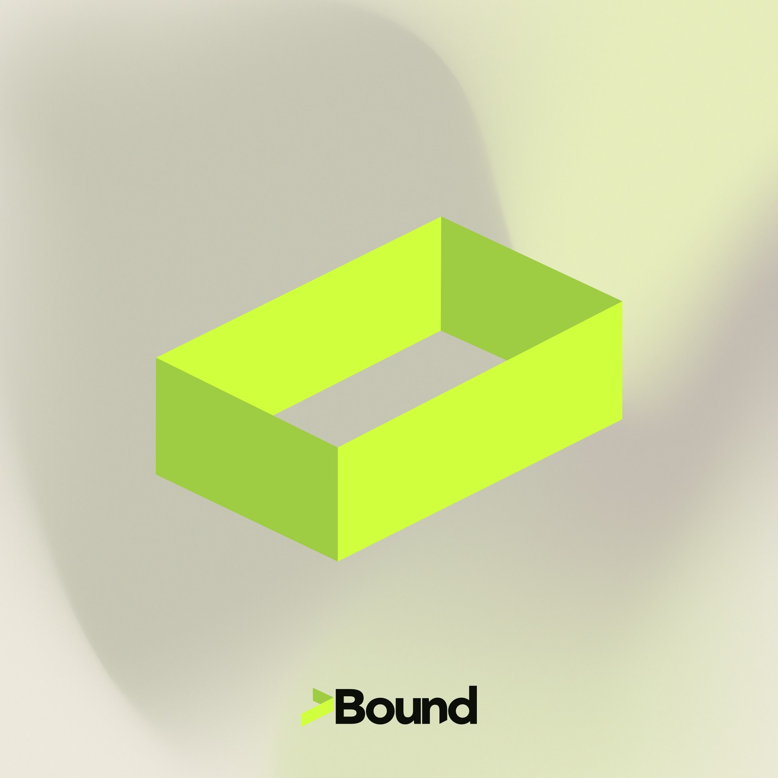
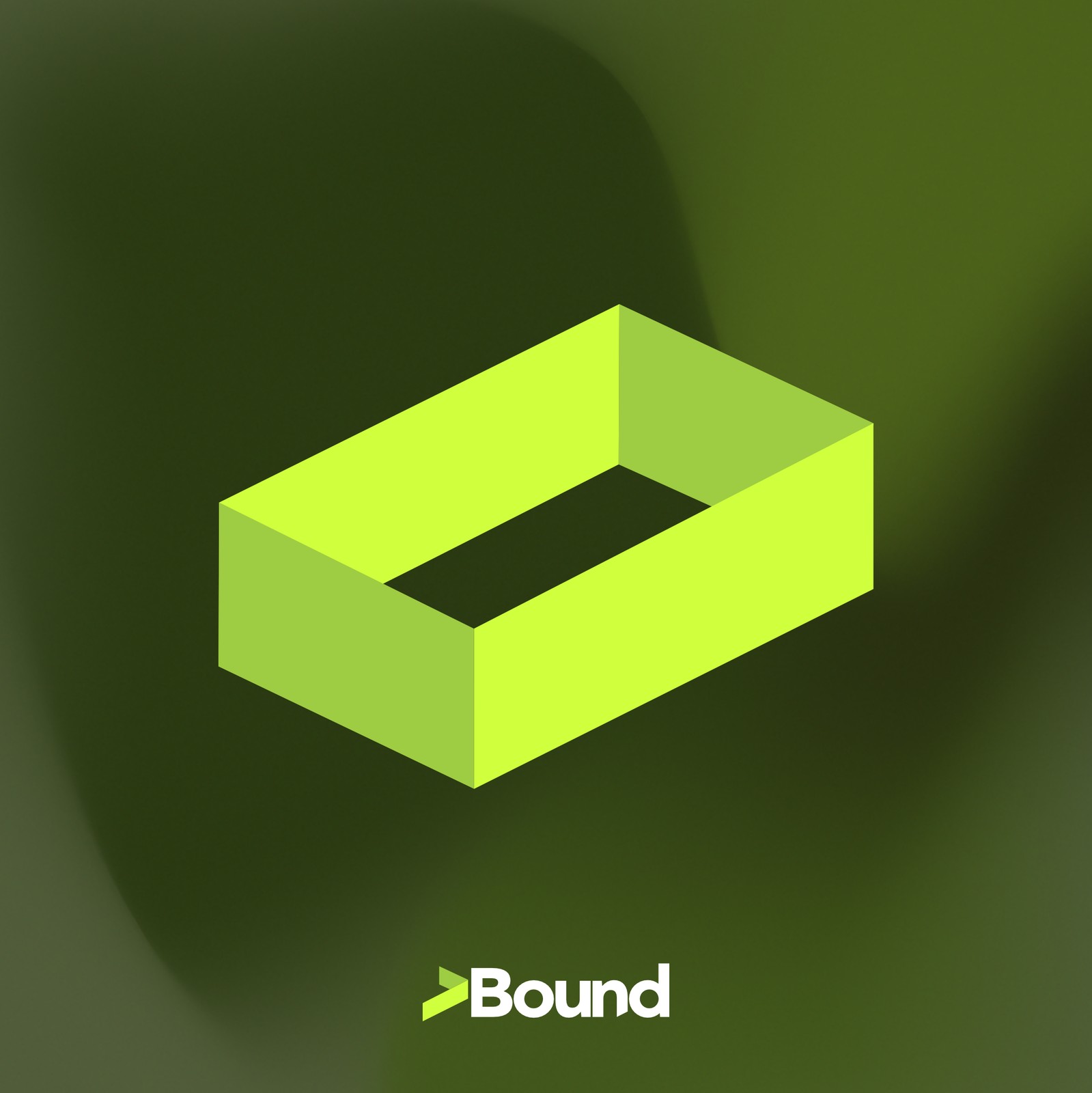
A forward arrow and an isometric open frame, built as one continuous shape rather than two icons.
Challenge
Most tech wordmarks default to an abstract symbol with no real connection to the name, or a literal illustration of the product. "Bound" already does interpretive work as a pun — restricted by what's come before, and bound for somewhere next. The brief: a mark where the name, the symbol, and the motto all say the same thing, with a visible before as well as an after. An arrow alone was rejected — it reads as generic "growth" iconography.
Poster Series
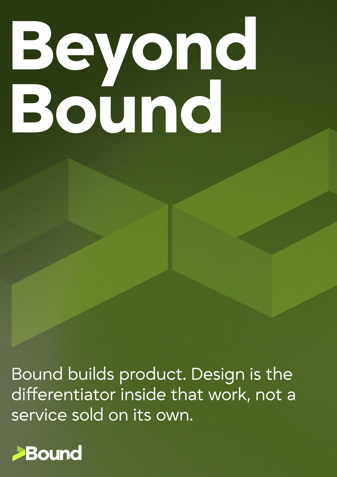
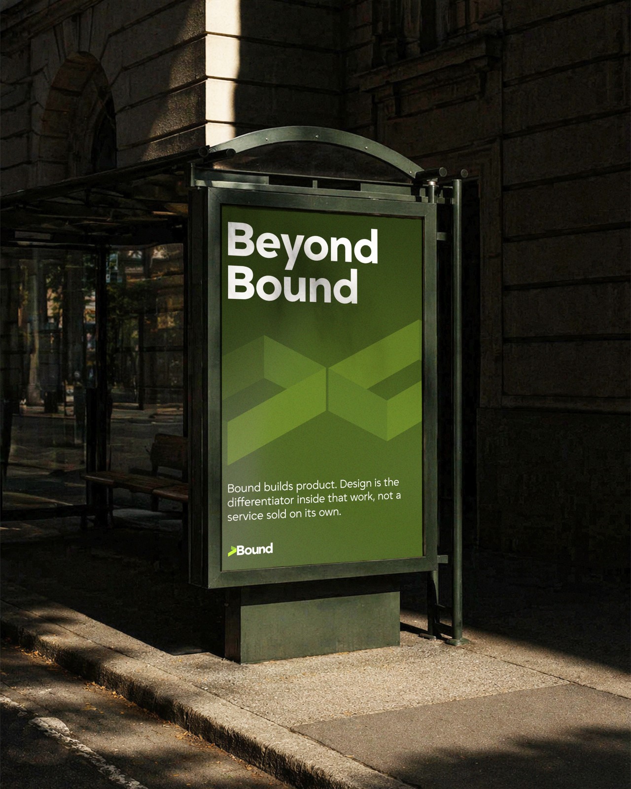
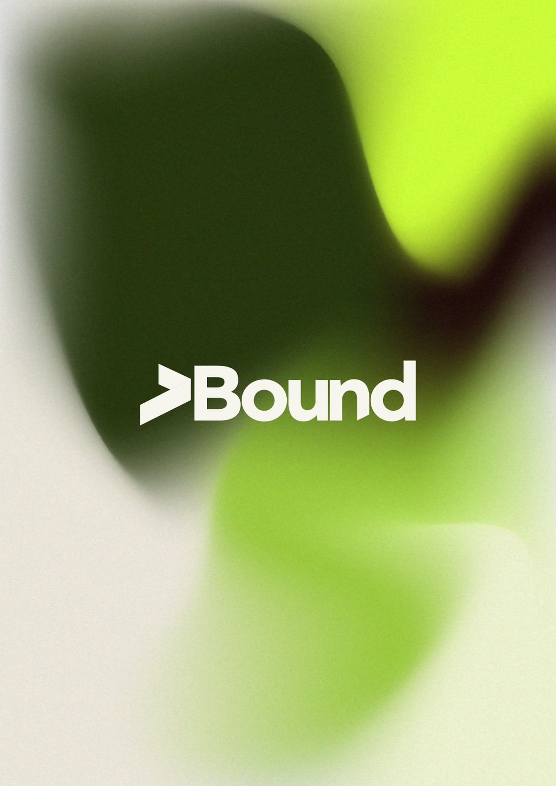
Type-led posters carrying the wordmark and mark into out-of-home applications.

Approach
The arrow — pointing forward and slightly upward — reads instantly as momentum: a build that ships, a limit exceeded. The isometric frame is the boundary made visible, drawn as a hollow loop rather than a solid block, so it reads as a way out rather than a wall. Together they stop being two icons and become one story: boundary, then breakout — carried by a single acid lime against near-black, restrained rather than broad, behaving like a system signal color: a build passing, a gate unblocked.
Applications
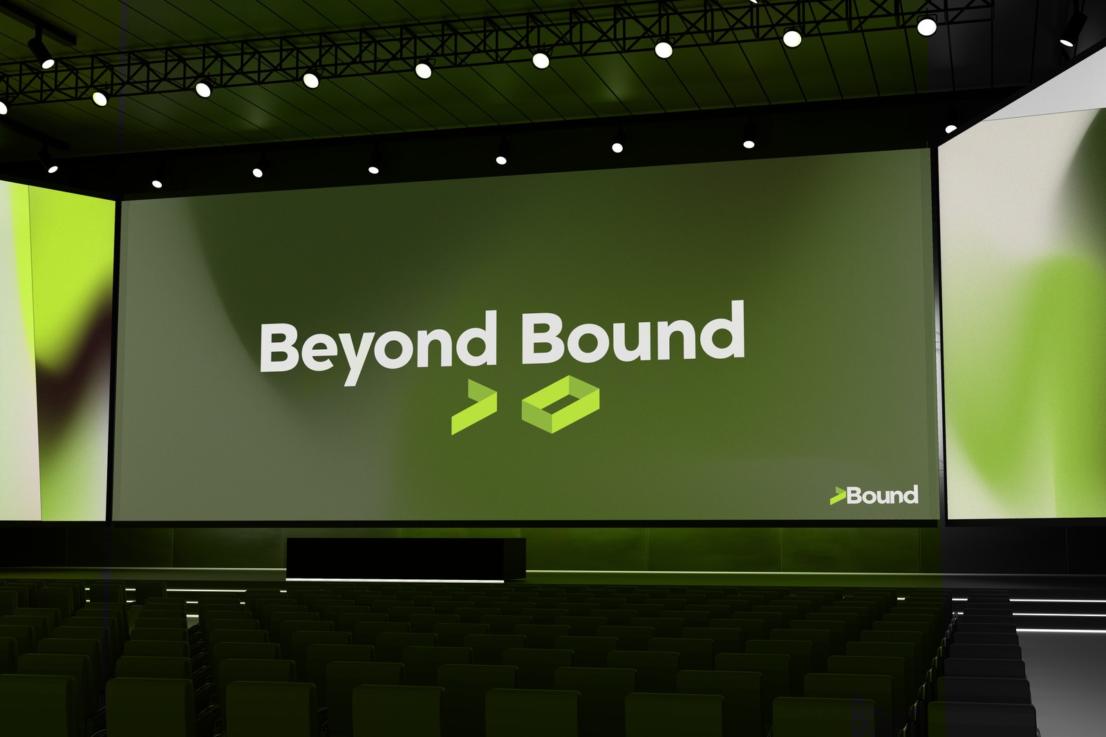
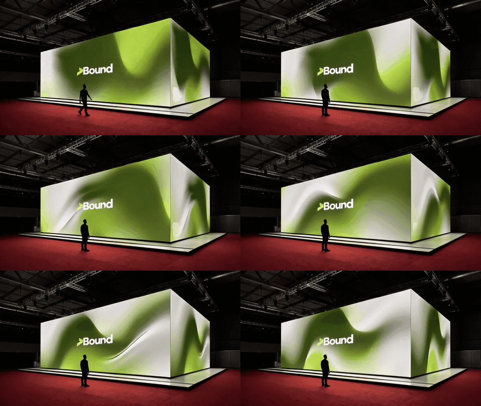
The system extended across posters, presentation environments, and an experiential booth.
Outcome
Bound (the constraint) → arrow (the act of exceeding it) → beyond (the promised state). The logic extends across palette, typography, motion, and applications, so every touchpoint — from a poster to an exhibition space — reads as the same idea at a different scale, not a new decoration layered onto an existing mark.
Brand Guide
Full interactive brand guidelines — logo construction, color, type, and applications.